
YYD SUSHI VISUAL IDENTITY 2021
DESIGN CONCEPT
YYD SUSHI 2021
友壹町回转寿司 / BRANDING DESIGN
OMO 面白设计
DESIGN / MIC
ILLUSTRATION / JOO
PHOTOGRAPHY / OH YEAH
友壹町寿司成立于2008年,是一家以回转形式供应寿司、料理产品的日式餐饮品牌。十几年的认真经营,友壹町陪伴不少当地消费者从孩提时代到成家立业,形象端也随着日渐陈旧,成为一个所谓的“老品牌”;面对疫情过后重新打开的餐饮市场和机遇,Z世代消费经济的冲击,友壹町以更新形象的方式重新介绍自己。
由于担心形象变更后所带来的“陌生感”和不确定因素,项目中途多次反复沟通协商,抽取其经典红色和漫画元素作为新形象的基础,并引入故事和IP人物丰富品牌形象。以漫画为基底,搞怪的、友好的人物故事由此展开。
Founded in 2008, Youyiding Sushi is a Japanese restaurant serving conveyor belt sushi delicacies. Over the past ten years or more, Youyiding has witnessed the growth of many local consumers, from childhood, to starting their career and to stepping into marriage. As time flies, it has gradually reduced to an obsolete brand. In face of the post-epidemic challenges and opportunities as well as the new consumer economy brought by Generation Z, Youyiding decided to redefine its image to meet the market demand.
To avoid the unfamiliarity and uncertainties caused by the image change, we have selected the classic red color and comic elements as the theme for the new image, and introduced stories and IP characters to enrich the brand. The story of comic characters unfolds in a humorous and friendly style.


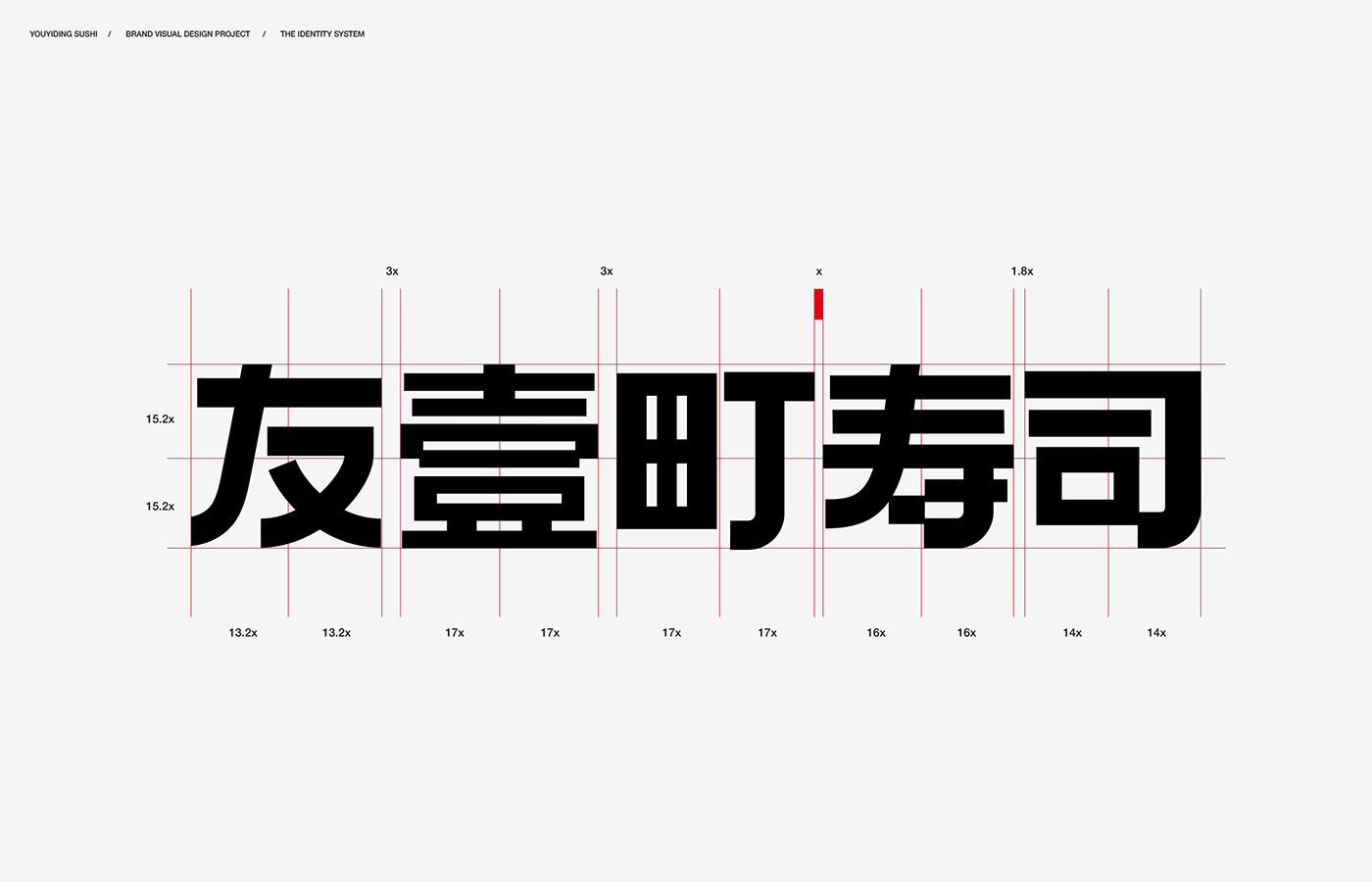
友 / な 之间的关系
中文和平假名的融合
友壹町的品牌名称起源自几个朋友合作创业的经历。。“友”字则成为重点需要突出的对象。
字形的设计需要寻找一个兼具中文识别与日文风格的平衡点。无意中发现日文平假名的"な”(na)与中文的友字造型相近,而"な”由于其横线曲线结合特点鲜明,两者结合后其微妙的混血感非常有趣。
The brand name of Youyiding originated from the entrepreneurial experience of the founders. “You (friendship)” highlights the core value of the restaurant.
The font design achieves a balance between identifiability in Chinese context and a unique Japanese style. It is accidentally found that the Japanese hiragana "な" is not only similar to the Chinese character of “友(friendship)”, but also very distinctive due to its combination of horizontal lines and curves. The subtle hybrid of the Chinese and Japanese characters makes the brand even more attractive.

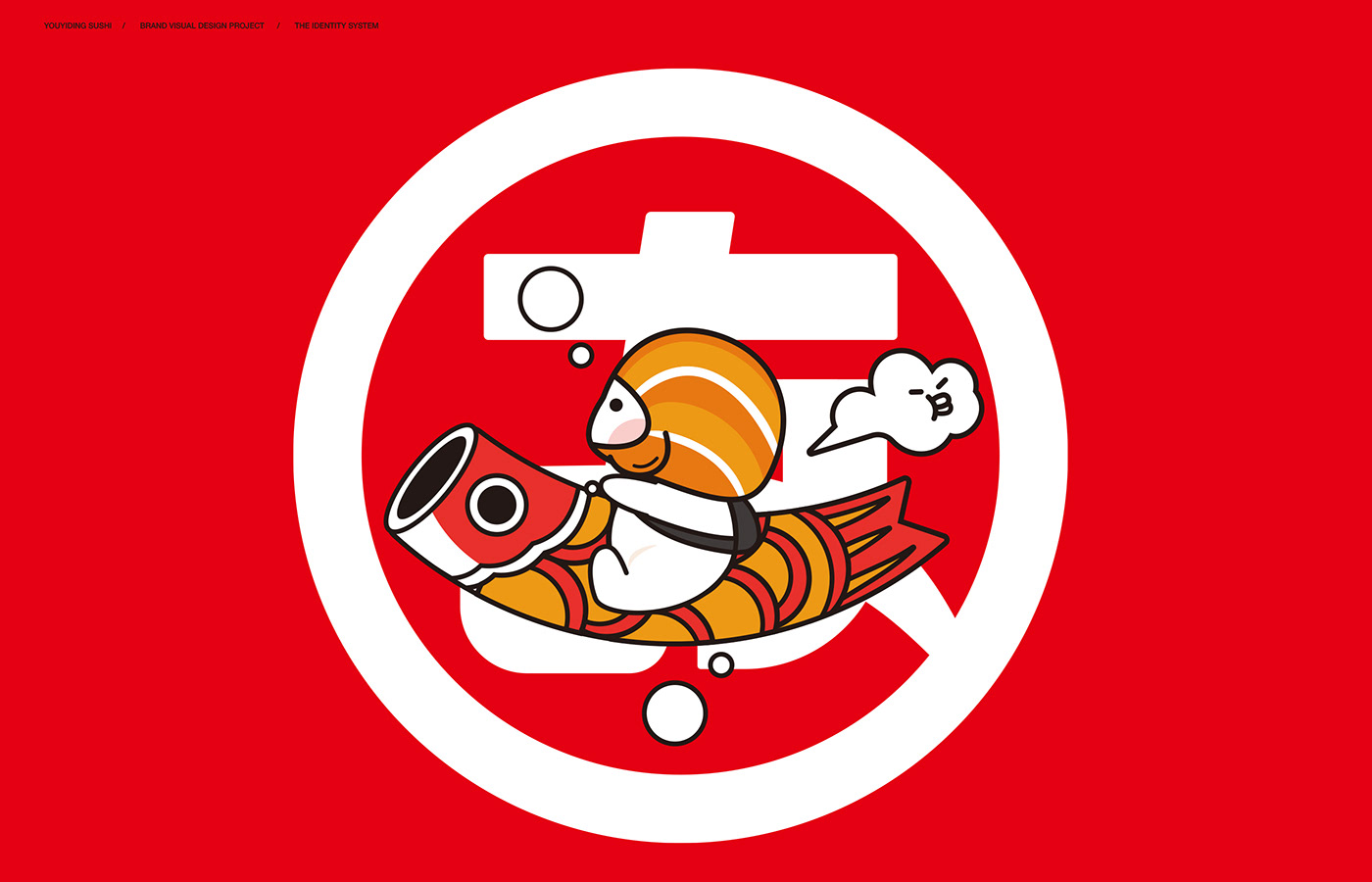
“JAPAN COMIC” / THE MAGICAL JOURNEY OF SUSHI
寿司星人的出击
品牌形象的软化,传达亲切友好,都由寿司星人搞定
他们负责友好和搞怪,外形像米饭一样的质朴而温暖,主形象以经典的三文鱼寿司为主,提供不同种类的寿司外形cos。除了搞怪之外,也设定各种漫画短故事和场景。
The soft power of the brand image, kindness and friendliness, is communicated by sushi attendants.
Cosplaying various sushi (mainly the classic salmon sushi), they look friendly and quirky, as neat and warm as rice. In addition to their funny appearances, a variety of short comic stories and scenes are set up for them.


“protagonists of the comics”
漫画元素的提取和使用,融入与消费者近距离接触的“前线”-寿司碟。
寿司好像漫画主角一样登场,寿司碟在一旁传达美味对味觉的冲击。
这是对器皿最美好的幻想。
The comic elements are also integrated into the "front line" - sushi plates, which are in close contact with consumers.
Sushi show up as protagonists of the comics, with the fancy sushi plates adding to the deliciousness.
This is to bring the sushi plates into full play.


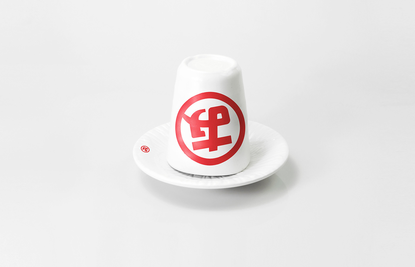
既然是“老品牌”,那就要有老品牌的样子。
效仿日本老字号品牌以字标和家纹为核心标记,将友字发扬光大吧。
漫画元素的使用不仅仅是直接的,跳出漫画框,
那种纸面语境的设定和氛围塑造也是有趣的表达方式。
An old brand honors its tradition.
Following the example of Japan's time-honored brands that use the wordmark and family crest as their icons, Youyiding hopes to celebrate the friendship in the same way.
Comic elements are not just straightforward.
They are also an interesting way to communicate values and stories, with classic comic boxes and the unique paper context to create a special atmosphere.


YYD SUSHI 2021
友壹町回转寿司 / BRANDING DESIGN
OMO 面白设计
DESIGN / MIC
ILLUSTRATION / JOO
PHOTOGRAPHY / OH YEAH


